Understanding Recipe Layout
With the advent of personal computers, desktop publishing as born. The ability to not only write word, but to determine how they looked on a page and integrated with images led to an explosion of do-it-yourself publishers with little or no actual design experience or understanding.
Typefaces or fonts, text size, alignment, subheads, columns, photo locations and white space all go into the readability of a page.
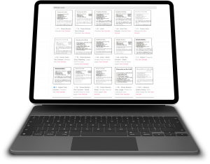
Nowadays, publishing systems, particularly cookbook publishing systems like CookbookFundraiser.com, take the burden of being a design expert off your shoulders with more than 20 pre-designed layout options. These layout options control how your recipes will look on the page and should meet the needs of most editors.
However, for those who have something else in mind for their fundraising cookbook, one of the layout options is “Custom Layout”. This allows the editor to change almost every aspect of the recipe, including title, contributor, ingredients, directions and comments. For each section you can select the font type and size, make it bold or italic, justify the text and even change the label for the personal notes.
Once of the basic tenants for good publishing is consistency. You don’t want each page to look completely different from the last as that can make it difficult for the reader to follow along. With CookbookFundraiser.com, once your layout is set, all of the recipes will automatically appear in that layout. Each one does not need to be manually adjusted every time. So if you want to see how your cookbook will look with different layouts, go ahead and play around to see what you like the best.
Here is a CookbookFundraiser.com Editor “ProTip” – While the layout applies to all of your recipes, the system will allow you to change the layout for each specific recipe if needed. If you have a recipes that does not fit on a page, consider making the text size just a little smaller. This often is not noticeable next to the other recipes and can get that extra text to fit on the page.
If you really want to get a good understanding of the use of layout, Colorado State University has published a wonderful article on desktop Publishing as a writing guide for it’s students. You can read the article at https://writing.colostate.edu/guides/guide.cfm?guideid=36#page4
Bill Rice is the Co-Publisher of Family Cookbook Project and CookbookFundraiser.com which helps individuals, churches, schools, teams and other fundraising groups create cherished personalized cookbooks using peer-to-peer tools and the power of the Internet to meet group funding needs. Follow us on Facebook, Twitter, Instagram and Pinterest!


